Brand Standards
Our brand is more than our logo. It is what we stand for in the hearts and minds of those who interact with us. It expresses our heart, soul and voice, and it effectively communicates why we matter to the community we serve. It also captures the essence of our points of difference, brand promise and character traits.
Click here to view the HelpLine Brand Guidelines.
Our Logo
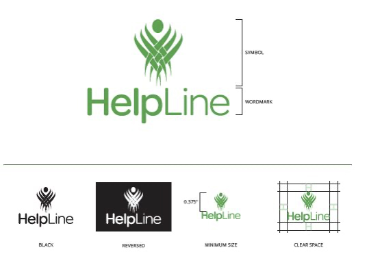
Our logo is the cornerstone of the HelpLine design system. It is instantly recognizable as the symbol that represents our organization. It should never be altered or distorted in any manner. It cannot be used as a substitute for “HelpLine” in writing. Our logo is made of up two components, the symbol and the wordmark. The symbol represents our work to support our community and empower change. This is reinforced in the wordmark, which emphasizes what we do—help. The color of our logo is HelpLine Green, which represents harmony and renewal.
Our primary logo is a stacked orientation. It should be used for most applications. Our black logo is for use only in documents that will be reproduced in black and white. The reversed logo may be placed on most dark backgrounds, as long as legibility is not compromised. The minimum size guideline protects our logo’s legibility. We measure minimum size by the height of the symbol. It should never appear smaller than 0.375 inches. Clear space helps maintain the visual integrity of our logo. It should not appear to be crowded by other elements such as text. We measure clear space by using the height of the “H” in our wordmark.


